User experience redesign for Ferris State University's student registration process.
The Problem
Hannah's Quote: "I wish it told me who the professors were because that's important to me"
William's Quote: "I wish the professors and other information was more accessible"
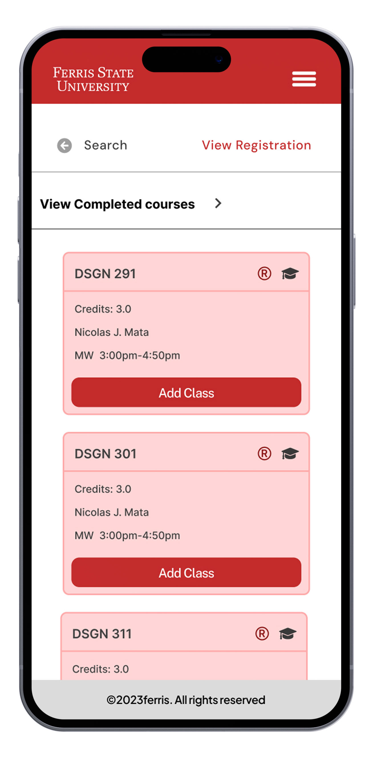
It took students six clicks to find information on one class
Maya's Quote: "I wish it was easier to do on your phone because I often register while I'm at work"
Gavin's Quote: "I wish you could do the registration and everything right there so I don't have to click through four different tabs to figure it out"
The Solution
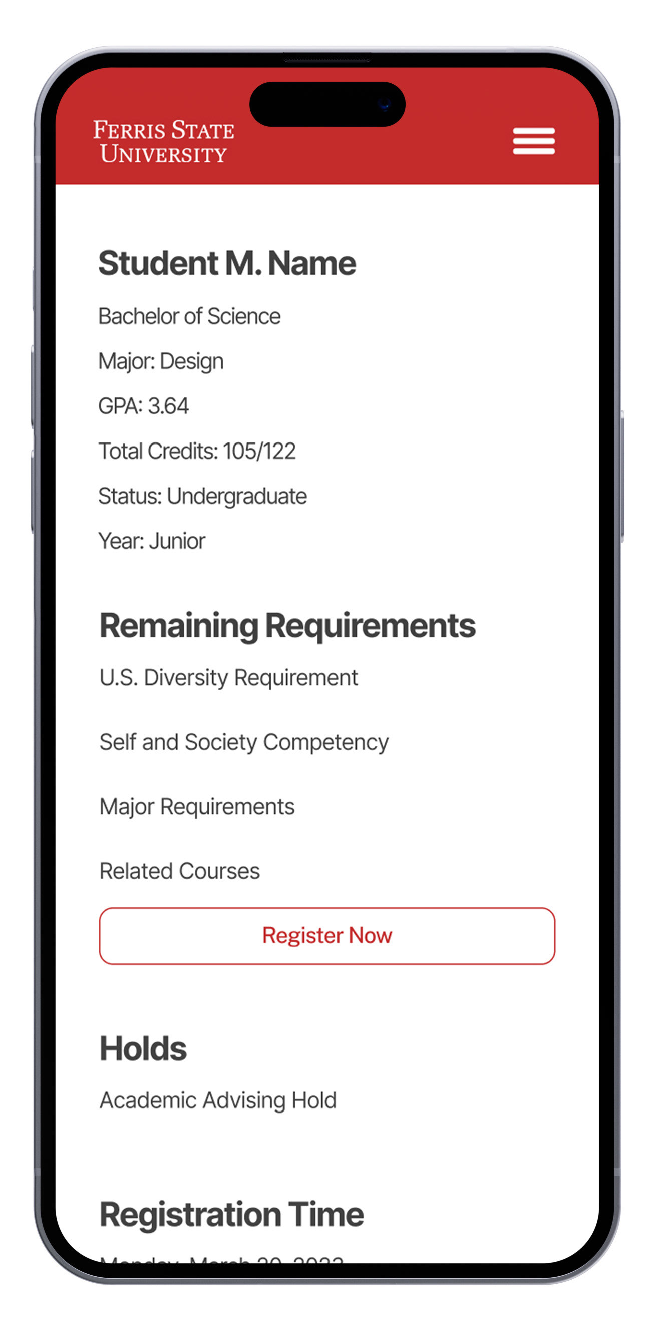
The home page displays relevant information for quick viewing by students.
Displayed on the home page is relevant information such as student information like total credits, GPA, their major, registration date and time, holds preventing registration, and the student's current class schedule.
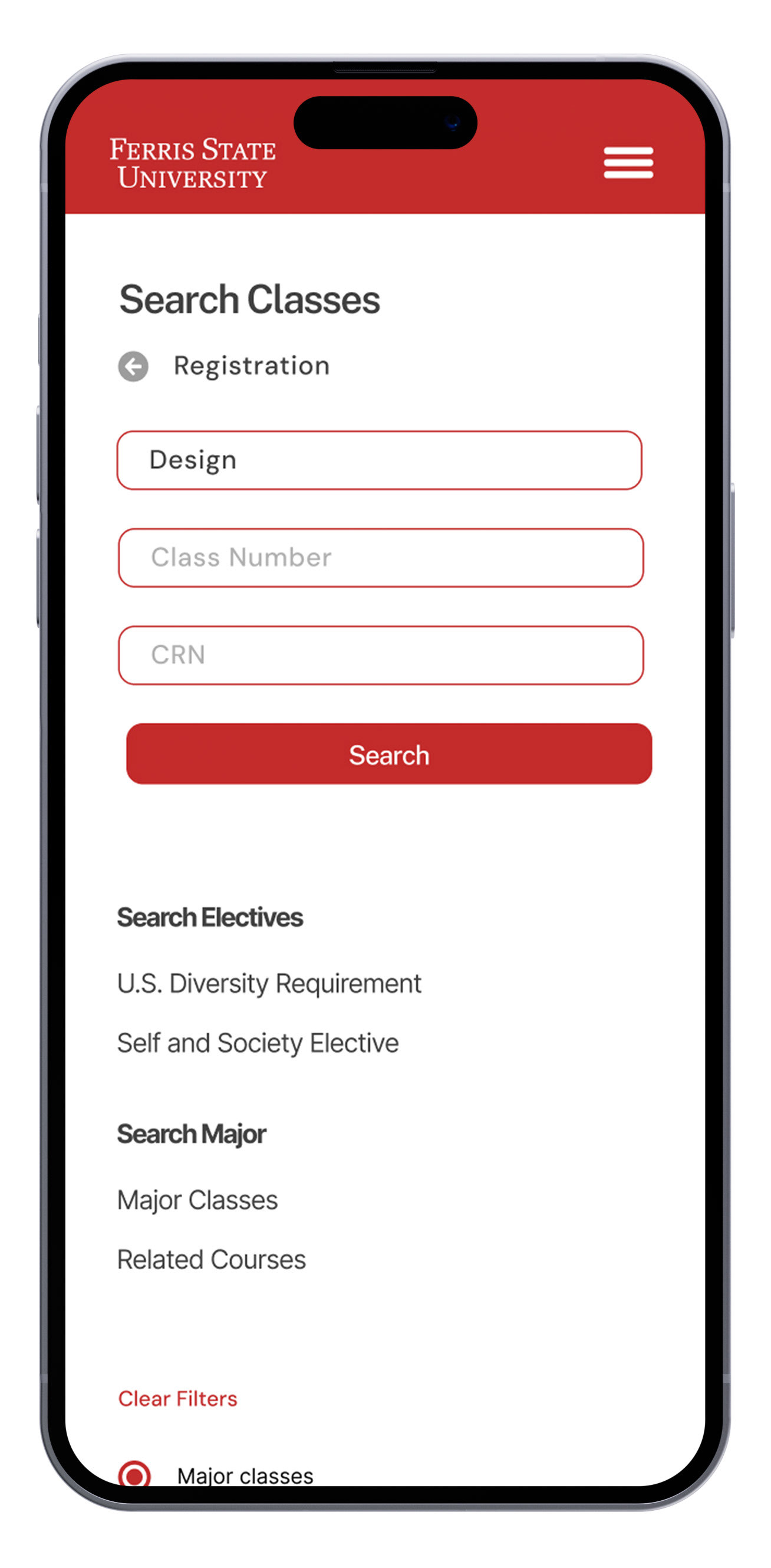
Quick search is available within the registration page for a quick way to add classes without going through the class search process.
Required classes are shown in the quick search automatically.
Students can save schedules for later registration or future semesters through the wishlist function.
Three page flow. First page: quick search option on the side allows students to view class categories that fit a specific requirement. Second page: after clicking a class category, it shows the classes that apply to your elective requirements, and only the ones that apply due to a filter on the side. Third page: If a student desires, they can remove the filters to reveal classes within the class type but may not apply to their schedule.
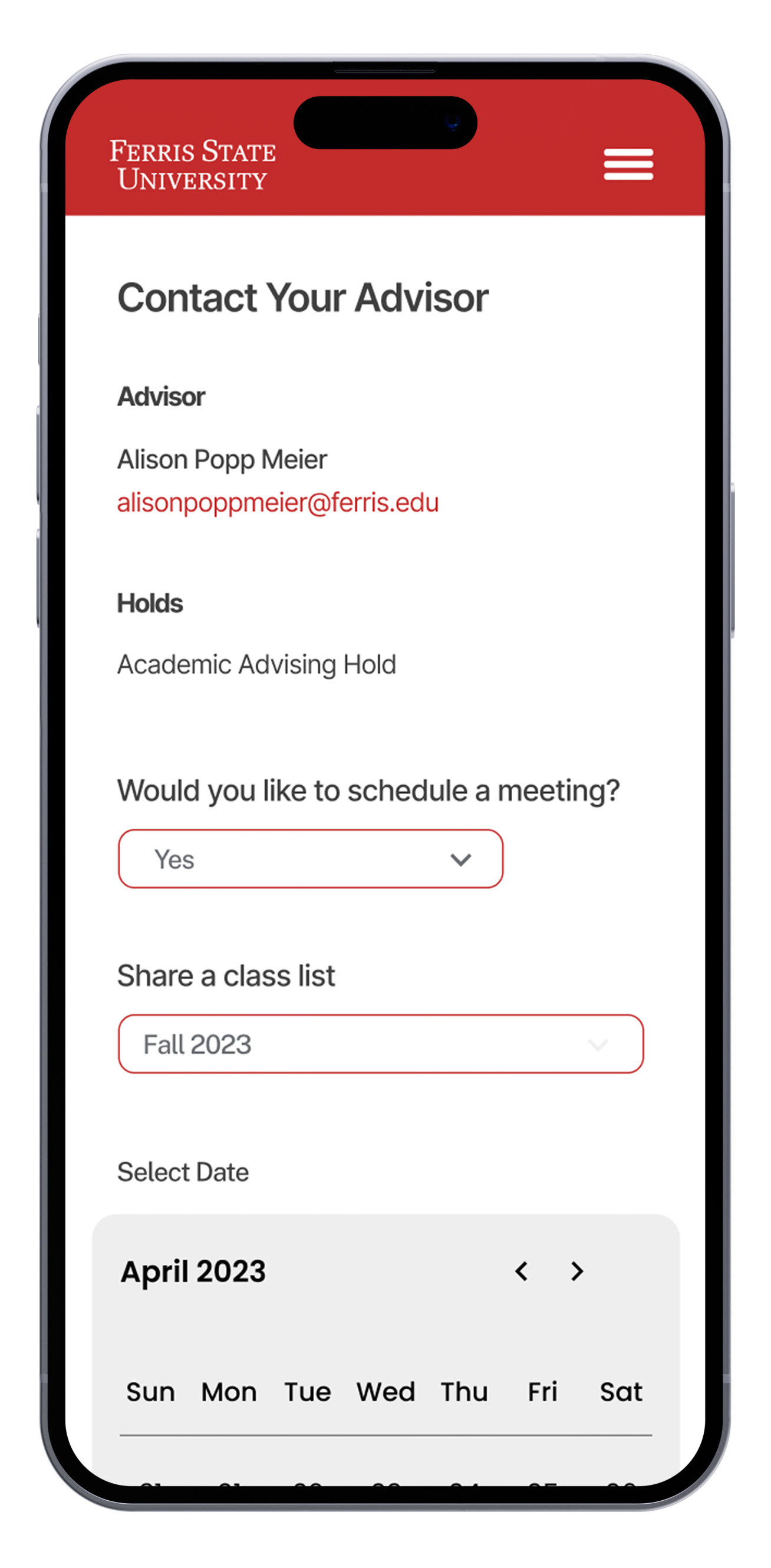
Students can send their schedule to their advisors for approval and choose to meet with their advisors if needed.
Back to Top