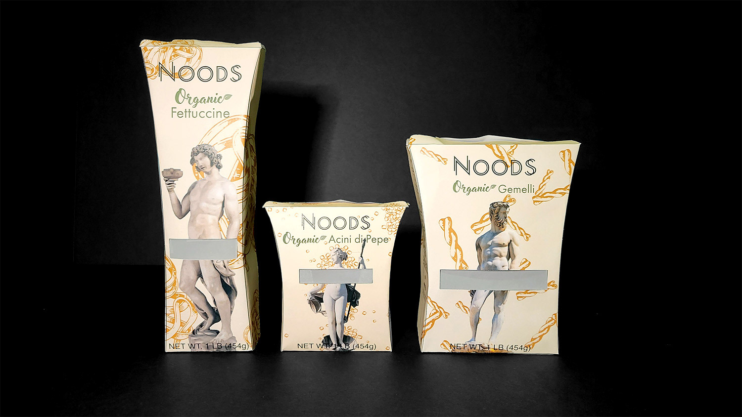
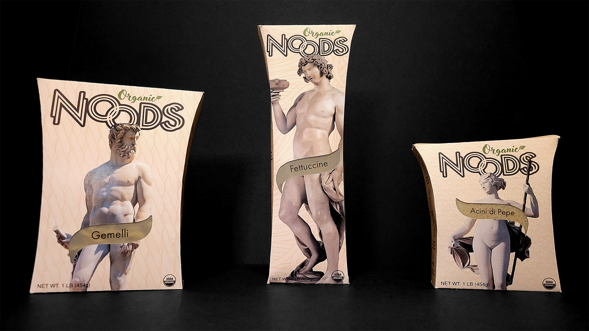
It was important to Noods that their packaging was sustainable, conveyed the humor of their brand, and communicates the authenticity of their Italian pasta.
During my initial research, I found that pasta is primarily sold in boxes or plastic bags and most Pasta brands who aim to be sustainable still use plastic for the window on their packaging.
Aiming to be 100% sustainable, Noods’ package uses glassine paper as an alternative to the plastic window. Glassine paper is listed as an approved packaging material for food by the FDA and is translucent so the pasta can still be viewed by consumers.
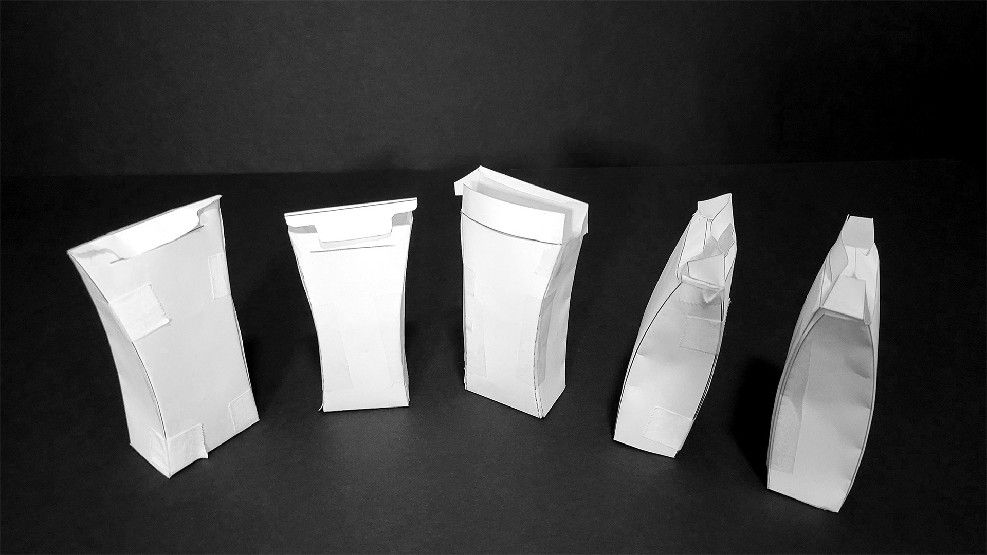
I used low-fi prototypes to quickly test variations in the opening of the box.
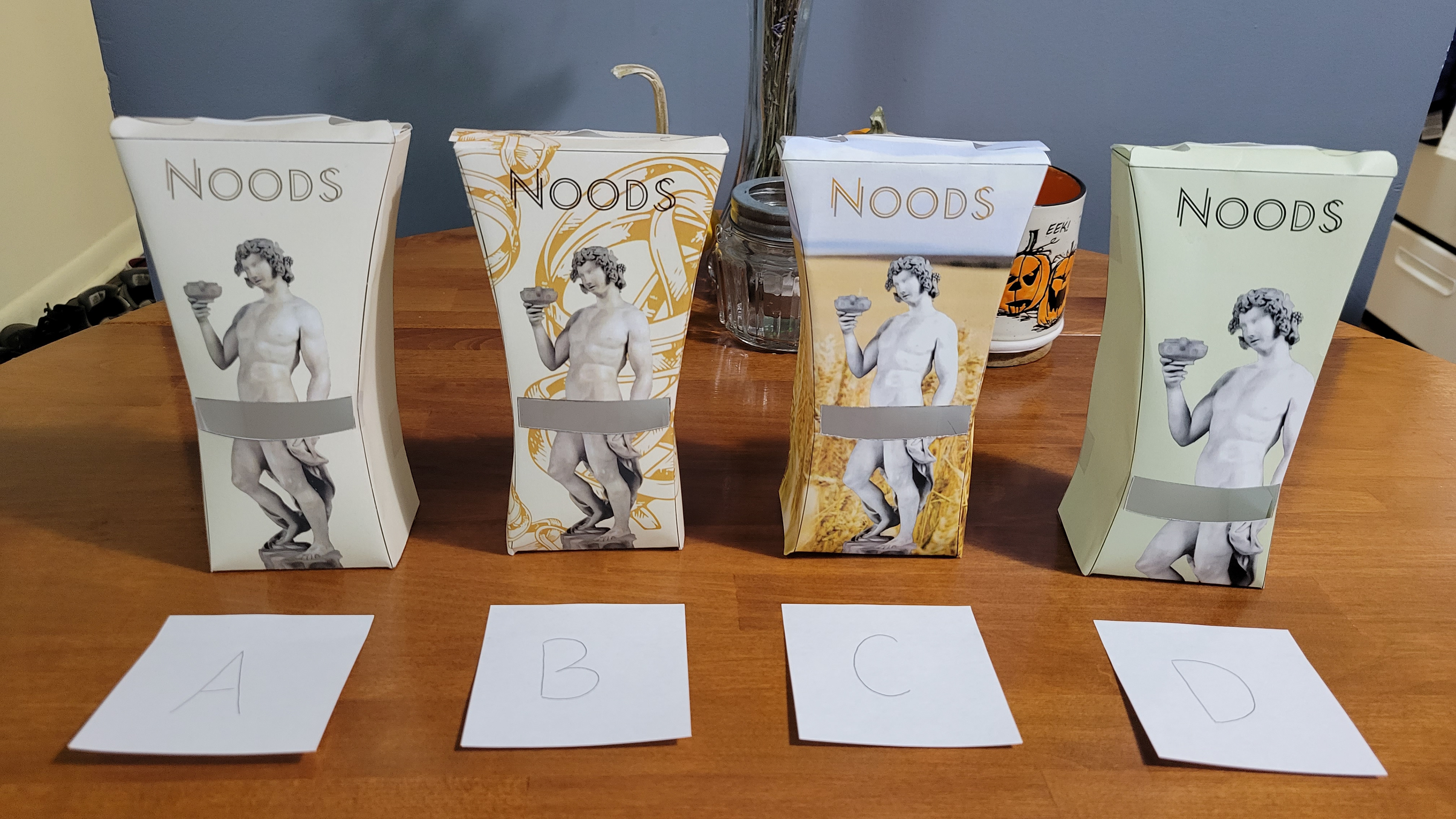
Playing off their name, I chose to display nude statues of greek gods designed by Italian artists on the fronts of their packaging. Not only are these statues designed by Italian artists, but they can also be found in Italy. The use of these statues link their pasta to Italy for authenticity.
The nakedness of the greek gods in relation to the brand name “Noods” create humor and strengthens the connection to being organic.
Each god is also matched to the type of pasta being sold based on recipes that can be made with each type of pasta.
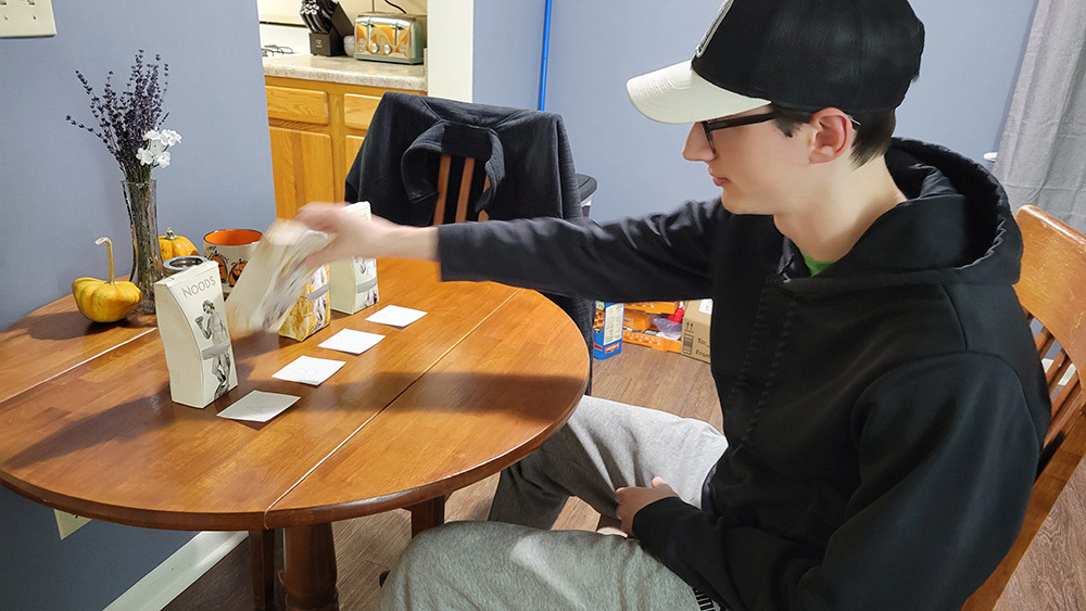
A/B testing was conducted to determine which design directions should be taken and what could communicate the qualities and values of the product best.
Users preferred the abstract noodle pattern, but felt like there should be green present to represent “organic."
Moving forward with the abstract background, I explored possible “green” directions that could be taken. It was ultimately decided that the tan package with green text was the best fit.
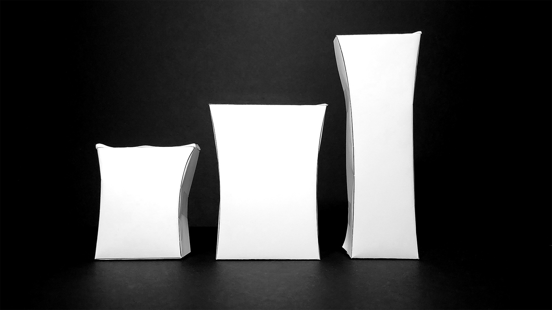
As I worked on the design, I measured current pasta boxes to determine the size of the Noods’ pasta boxes and tested the fit of the pasta in full-size prototypes.
In the end, I simplified the noodle pattern in the background, enlarged the statues for emphasis, and made the brand mark more prominent.